Developing a Dynamic Hamburger Menu in React: A Step-by-Step Guide
Published on February 12, 2024
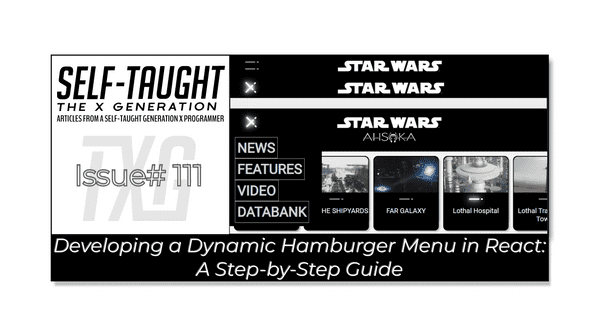
Join me as I continue building a React website with the help of my AI assistant! This installment focuses on a Hamburger menu, which consists of two Lightsaber components that light up and form an X!
Introduction
In this article, I will continue to cover React concepts I am learning by pair programming with AI to create a Star Wars Ahsoka website.
This article will focus on creating a "Hamburger menu." This menu will consist of two Lightsaber components that light up and form an X when activated! To create the Hamburger menu, we will utilize components and a mapping function that were created and explained in previous articles of this series.
Prerequisites
Building on the series of articles about creating a "Star Wars Ahsoka React website", understanding the creation of a "Hamburger" menu requires familiarity with certain concepts. Please refer to my previous articles to understand the custom components and functions used.
The prerequisites for creating the dropdown menu include:
- Familiarity with the Menu and Navbar components.
- Familiarity with the StarWarsCard, SmallCardContent, and LargeCardContent components.
- Understanding of the mapItems function used for generating multiple components.
Article series:
- Building a Dropdown Menu in React: A Step-by-Step Guide
- A Guide to Better Code Organization in React through File Separation
- Learn to Use Component Identifiers as Props for Rendering Various HTML Elements Dynamically
The process of creating the Hamburger menu
In the past, I have created vanilla JavaScript and CSS Hamburger menus following tutorials. However, I have yet to create one for my own projects.
While developing this Star Wars Ahsoka React website, which is inspired by the actual Star Wars website, I decided to create and implement a Hamburger menu similar to the one featured on the official Star Wars site. This was also the first time I had created a React hamburger menu!
So, the main idea of a hamburger menu, in general, is to reorganize menu buttons on small screen sizes to reduce clutter. This is accomplished by hiding all of the menu buttons in an element that loosely resembles a hamburger, typically with three stacked lines.
The actual Star Wars website's hamburger menu is designed using two lightsabers with a regular line in the middle.
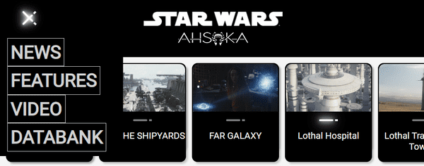
When this hamburger menu is active, the two lightsabers form an X, and the middle line just disappears.
So, taking creative liberty and simplifying my version of the Hamburger menu, I opted for just two lines representing lightsabers that light up and form the X when active.
The code for my hamburger menu
In my hamburger menu, I utilized the Lightsaber component that I had previously created. This component is designed with an active and inactive state, determining when the lightsabers light up.
The structure of my hamburger menu code is similar to what I previously developed for the Navbar component. It initiates a dropdown menu when a user hovers over a category button.
However, the mapping function, which is integral to rendering the chosen category, doesn't operate directly within the hamburger menu or the Navbar. Instead, it's used in the main App component. Here, it iterates over the selected category and returns an array of StarWarsCard components, each configured with props derived from the corresponding item in the selected category array.
I ran into a problem with the expanding dropdown menu; it would remain open after the hamburger menu was closed. So, I consulted my AI assistant, asking for help in writing the code needed to resolve the issue. Then, I learned a valuable lesson when working with AI: make sure you provide clear context to what you want to achieve!
By simply stating to AI that I wanted code that closes the expanding dropdown menu, I ended up wasting a lot of time because the code provided did not work as expected. I got frustrated and ended up using git restore to reset my code and start over. I then clearly provided context in my prompt to my AI assistant, stating that I was looking for a simple solution to make sure that every time the hamburger menu is opened, the expanding dropdown menu will remain closed. I finally got the simple solution I was looking for, which is the following useEffect hook that closes the expanding dropdown menu if it is open.
    useEffect(() => {
        if(isActive) {
            setDatabankVisible(false);
        }
    }, [isActive]);
💡 Tip: When generating code, take the time to clearly define what you want to achieve in your AI prompts. This will save you valuable time and avoid unnecessary complications. Remember, there are always multiple ways to code a solution.
The CSS for my hamburger menu
I knew creating a hamburger menu using CSS was not going to be easy. I did know that I would need to use CSS position absolute and relative to overlap the two Lightsaber components to form an X. However, my first attempt sent one of the Lightsaber components to the middle of the page (not the hamburger menu! 🍔)
Once I created additional classes for the hamburger menu, with some trial and error, I positioned the Lightsaber components to rest stacked and form an X as expected.
However, an unexpected side effect happened: once the hamburger menu was selected, in addition to the Lightsaber components forming an X, the other Lightsabers associated with the selected card components on the page rose in the X position! Tempted to leave it as is, I opted to solve this error by creating extra CSS classes for the Lightsaber components in the hamburger menu to isolate them.
Since this project's hamburger menu CSS code is extensive, I decided to include it in its own section toward the end of his article.
The Hamburger menu component
And now to the task at hand! In this section, I detail the creation of the Hamburger menu component.
Imports
useState and useEffect are the React hooks we use in the Hamburger menu component. useState is used to add state management to functional components. In this case, it's used to manage the visibility of the hamburger menu and the "Databank" dropdown.
useEffect is used to perform side effects in function components. In this case, it's used to hide the "Databank" dropdown whenever the hamburger menu's visibility changes.
Lightsaber is a custom component that's used to create the lines of the hamburger icon.
Menu is another custom component. It's used to create the dropdown menu that appears when the hamburger icon is clicked.
import React, { useState, useEffect } from 'react';
import Lightsaber from './Lightsaber';
import Menu from './Menu';
State variables
The isActive state variable is used to track whether the hamburger menu is open or closed. When isActive is true, the hamburger menu is open; when it's false, the menu is closed.
The isDatabankVisible state variable is used to manage the visibility of the "Databank" dropdown in the hamburger menu. When isDatabankVisible is true, the "Databank" dropdown is displayed; when it's false, the dropdown is hidden.
const [isActive, setIsActive] = useState(false);
const [isDatabankVisible, setDatabankVisible] = useState(false);TheHamburgerMenufunction is a React functional component that creates the hamburger menu. It receives two props:
categories- This prop is expected to be an array of categories that will be used to populate the menu items in the dropdown menu.setSelectedCategory- This is a function prop that is used to update the state of the parent component when a category is selected from the dropdown menu. The selected category is passed as an argument to this function.
export default function HamburgerMenu({ categories, setSelectedCategory }) {

}
Creating the Hamburger Icon
In this code block, a div element with the class "hamburger-menu" is being returned. This div acts as the container for the hamburger icon and has an onClick handler attached to it, which triggers the handleClick function when the div is clicked.
Inside this div, there are two Lightsaber components, representing the two lines of the hamburger icon. Each Lightsaber component has an isActive prop and a className prop.
The isActive prop is a boolean that determines the state of the lightsabers. If isActive is true, the lightsabers are crossed (as in an opened hamburger menu). If isActive is false, the lightsabers are parallel (as in a closed hamburger menu).
The className prop sets the class of the Lightsaber component. A conditional (ternary) operator is used to check if isActive is true or false. If isActive is true, the class of the Lightsaber is set to "hamburger-lightsaber-1 active" or "hamburger-lightsaber-2 active", which applies certain styles to represent an opened hamburger menu. If isActive is false, the class is set to "hamburger-lightsaber-1" or "hamburger-lightsaber-2", which applies different styles to represent a closed hamburger menu.
    return (
        <div className="hamburger-menu" onClick={handleClick}>
            <Lightsaber isActive={isActive} className={isActive ? "hamburger-lightsaber-1 active" : "hamburger-lightsaber-1"} />
            <Lightsaber isActive={isActive} className={isActive ? "hamburger-lightsaber-2 active" : "hamburger-lightsaber-2"} />
        </div>
    );
Building the Dropdown Menu in the Hamburger Component
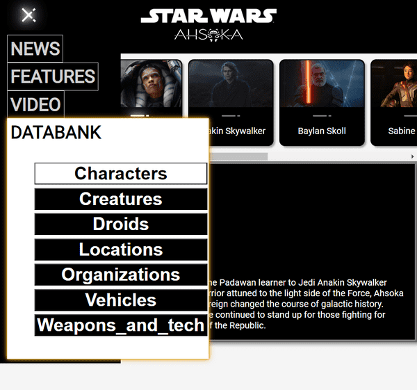
This code block renders a dropdown menu when the hamburger menu is active, i.e., when isActive is true. The dropdown menu is a div with the class "dropdown-menu", containing several child div elements, each representing a navigation button.
The "Databank" button has two event handlers attached to it - onMouseEnter and onMouseLeave. When the mouse cursor enters the area of the "Databank" button, onMouseEnter sets isDatabankVisible to true, revealing the Menu component. Conversely, when the mouse cursor leaves the "Databank" button area, onMouseLeave sets isDatabankVisible to false, hiding the Menu component.
The Menu component is only rendered if isDatabankVisible is true. It takes two props - setSelectedCategory, a function that sets the selected category, and categories, a list of available categories.
            {isActive && (
                <div className="dropdown-menu">
                    <div className="navbar-buttons">NEWS</div>
                    <div className="navbar-buttons">FEATURES</div>
                    <div className="navbar-buttons">VIDEO</div>
                    <div className="navbar-buttons" onMouseEnter={() => setDatabankVisible(true)} onMouseLeave={() => setDatabankVisible(false)}>
                        DATABANK
                        {isDatabankVisible && (
                            <Menu setSelectedCategory={setSelectedCategory} categories={categories}/>
                        )}
                    </div>
                </div>
            )}
The handleClick function
The handleClick function is a toggle function that switches the isActive state between true and false every time it's called. It works by calling the setIsActive function (which is the setter function returned by the useState hook) with the negated value of the current isActive state. So, if isActive is currently true, setIsActive(!isActive) will set it to false and vice versa. This function is used to handle opening or closing the dropdown menu.
    function handleClick() {
        setIsActive(!isActive);
    }
The useEffect hook
The useEffect hook is used here to perform a side effect whenever the isActive state changes. The side effect in this case is setting the isDatabankVisible state to false.
In other words, whenever the isActive state changes (the hamburger menu is opened or closed), the useEffect hook is triggered and sets isDatabankVisible to false. This effectively hides the "Databank" dropdown each time the hamburger menu is toggled.
    useEffect(() => {
        if(isActive) {
            setDatabankVisible(false);
        }
    }, [isActive]);
The completed Hamburger menu component
import React, { useState, useEffect } from 'react';
import Lightsaber from './Lightsaber';
import Menu from './Menu';

export default function HamburgerMenu({ categories, setSelectedCategory }) {

    const [isActive, setIsActive] = useState(false);
    const [isDatabankVisible, setDatabankVisible] = useState(false);

    useEffect(() => {
        if(isActive) {
            setDatabankVisible(false);
        }
    }, [isActive]);

    function handleClick() {
        setIsActive(!isActive);
    }

    return (
        <div className="hamburger-menu" onClick={handleClick}>
            <Lightsaber isActive={isActive} className={isActive ? "hamburger-lightsaber-1 active" : "hamburger-lightsaber-1"} />
            <Lightsaber isActive={isActive} className={isActive ? "hamburger-lightsaber-2 active" : "hamburger-lightsaber-2"} />
            {isActive && (
                <div className="dropdown-menu">
                    <div className="navbar-buttons">NEWS</div>
                    <div className="navbar-buttons">FEATURES</div>
                    <div className="navbar-buttons">VIDEO</div>
                    <div className="navbar-buttons" onMouseEnter={() => setDatabankVisible(true)} onMouseLeave={() => setDatabankVisible(false)}>
                        DATABANK
                        {isDatabankVisible && (
                            <Menu setSelectedCategory={setSelectedCategory} categories={categories}/>
                        )}
                    </div>
                </div>
            )}
        </div>
    );
}
CSS for the Hamburger menu
Although the entire CSS code for this project is viewable on GitHub, I included the hamburger CSS code here to help you understand how it works.
Hamburger Menu Container
This sets up the container for the hamburger icon. It's a flex container with its children stacked vertically and evenly spaced. The cursor is set to pointer to indicate it's clickable.
.hamburger-menu {
  display: flex;
  flex-direction: column;
  justify-content: space-around;
  width: 2rem;
  height: 2rem;
  margin: 0 25px;
  padding: 10px;
  cursor: pointer;
  position: relative;
  z-index: 2;
}
Hamburger Menu Lines (Lightsabers)
These styles control the appearance and animation of the hamburger icon lines. When active, they rotate to form an 'X'.
.lightsaber {
  display: flex;
  justify-content: center;
  align-items: center;
  margin-top: 10px;
  transition: transform 0.05s ease-in-out;
}

.hamburger-lightsaber.active {
  transform: rotate(45deg);
}

.hamburger-lightsaber-1.active {
  position: absolute;
  bottom: 5;
}

.hamburger-lightsaber-1.active {
  transform: rotate(45deg);
}

.hamburger-lightsaber-2.active {
  transform: rotate(-45deg);
}
Dropdown Menu
This is the dropdown menu that appears when the hamburger icon is clicked. It's positioned absolutely, allowing it to appear over other content.
.dropdown-menu {
  position: absolute;
  margin-top: 6px;
  margin-left: -25px;
  padding: 8px;
  color: white;
  background-color: black;
  width: 200px;
  z-index: 1;
  display: flex;
  flex-direction: column;
  align-items: flex-start;
}
Media Queries
This media query hides the hamburger menu on screens wider than 750px, making it a mobile-only feature.
@media (min-width: 750px) {
  .hamburger-menu {
    display: none;
  }
}
Lightsaber Styles
These styles define the appearance of the lightsabers in both inactive and active states, including a glow animation when active.
.lightsaber-saber,
.lightsaber-saber-active {
  width: 25px;
  height: 3px;
  position: relative;
  border-radius: 50px;
}

.lightsaber-saber {
  background-color: grey;
}

.lightsaber-saber-active {
  background-color: white;
}

.lightsaber-saber.glow {
  box-shadow: 0 0 2px white, 0 0 4px white, 0 0 6px white, 0 0 8px white;
  animation: glow .01s infinite;
}

@keyframes glow {
  0% {
    box-shadow: 0 0 5px white, 0 0 10px white, 0 0 15px white, 0 0 20px white;
  }
  50% {
    box-shadow: 0 0 10px white, 0 0 20px white, 0 0 30px white, 0 0 40px white;
  }
  100% {
    box-shadow: 0 0 5px white, 0 0 10px white, 0 0 15px white, 0 0 20px white;
  }
}
The project so far
Here are the links to the project:
My other articles in this series
- Learn to Use Component Identifiers as Props for Rendering Various HTML Elements Dynamically
- A Guide to Better Code Organization in React through File Separation
- Building a Dropdown Menu in React: A Step-by-Step Guide
Advance your career with a 20% discount on Scrimba Pro using this affiliate link!
Become a hireable developer with Scrimba Pro! Discover a world of coding knowledge with full access to all courses, hands-on projects, and a vibrant community. You can read my article to learn more about my exceptional experiences with Scrimba and how it helps many become confident, well-prepared web developers!
Important: This discount is for new accounts only. If a higher discount is currently available, it will be applied automatically.
How to Claim Your Discount:
- Click the link to explore the new Scrimba 2.0.
- Create a new account.
- Upgrade to Pro; the 20% discount will automatically apply.
Disclosure: This article contains affiliate links. I will earn a commission from any purchases made through these links at no extra cost to you. Your support helps me continue creating valuable content. Thank you!
Conclusion
In this chapter of my journey towards building a Star Wars Ahsoka React website with AI assistance, I delved into the creation of a dynamic Hamburger menu, a critical feature in modern web design, especially for mobile-friendly interfaces!
Creating this Hamburger menu presented its own unique set of challenges. I used my previously created Lightsaber components for this menu to ensure clean code and to incorporate glowing lightsabers that form the X menu icon! However, positioning the Lightsabers to form the menu icon proved challenging. I was able to achieve the desired effect with additional CSS classes, as well as the right CSS positioning and transformations. However, this also led to another unexpected side effect where other Lightsaber components on the page also transformed unintentionally. This was finally resolved by isolating the CSS classes for the Lightsaber components within the hamburger menu.
I also wasted a lot of time trying to make sure my additional dropdown menu was closed each time the Hamburger menu was opened by incorporating AI-generated code. I eventually discovered a simple solution using a useEffect hook that closed the dropdown menu each time the hamburger menu was activated. This was achieved by starting over and taking the time to provide details and context of what I wanted the code to accomplish in the AI prompt. This experience emphasized the importance of clear communication when seeking help via AI prompts, as demonstrated in my interaction with Rix.
The most effective way to learn programming is to dive in and get your hands dirty! Engage in coding, experiment with new technologies like AI, and don't be afraid to break things. Remember that you can always use version control to revert your changes and restore your project to its previous working state, as I did!
Let's connect! I'm active on LinkedIn and Twitter.
Are you now adept at creating a dynamic Hamburger menu in React? Have you tried making your own version of a themed Hamburger menu? Please share the article and comment!
Please share it!


