Building Flexible React Components for Dynamic HTML Layouts
Published on June 24, 2024
Join me as I continue building a React website with the help of my AI assistant! This installment focuses on developing a dynamic News component that renders varying HTML layouts based on object data.
Introduction
In this article, I will continue covering React concepts I am learning through pair programming with AI to create a Star Wars Ahsoka website, focusing on building a flexible React component for dynamic HTML layouts.
I will explain how I created and used a News component to display articles with varying HTML paragraphs and images based on conditions.
I'll also cover the conditional rendering process and the challenges I faced during integration.
Article Concept Overview
The problem:
Hardcoded HTML structures in React components are inflexible and cannot accommodate varying content layouts, such as different combinations of paragraphs and images.
The solution:
Create a dynamic React component that renders HTML elements based on object data, allowing flexible and adaptable content layouts.
Hardcoded Components
Until now, the HTML structure inside the React components I create has been hardcoded. Components such as website headers and footers have a pretty solid and stationary HTML structure, so I had no issues in creating them.
But when I tried to design a "News" component inspired by articles displayed on the Star Wars website, I realized that each article's body structure varies! For example, one article's body might have three paragraphs, an image, and a fourth paragraph, while another might have one paragraph, an image, and then five more paragraphs.
A hardcoded HTML structure in a React component won't work if the content varies. The solution is a component that dynamically renders HTML elements.
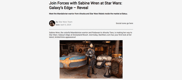
Examine the two news article examples below with different paragraph structures:
- Left: 2 paragraph tags <p>, 1 image tag <img>
- Right: 5 paragraph tags <p>, 1 image tag <img>
These examples clearly illustrate the need for a dynamic approach to rendering HTML elements in React components.
Dynamically Rendered Component
My solution for handling varying HTML content layouts is to create an Article component within the News component. The Article component maps over an array of content objects and conditionally renders paragraphs and images, ensuring flexibility and adaptability in the layout. The Article component is then rendered inside the News component as follows:
<Article content={articleContent} />In React, it's common to create components inside other components, called Nested Components, to keep specific functionality separate and reuse code. This method follows best practices by breaking down the UI into smaller, manageable parts, making the code more modular and easier to maintain.
The Article Sub-Component
This section covers my pain point: creating a component that dynamically renders HTML tags. To be more specific, how do I render <p> and <img> tags that vary in number and layout? The solution is to write a small program that maps over the data object holding each article. Each object contains the <p> and <img> tags in the correct order, and the program pushes them into an articleContent array in that order.
Notice how the<p>(paragraph_1:) and<img>(image_1:) tags vary in number and layout in the news object array:
const news = [
	{
		story: 0,
		image: story_0_image_title,
		name: 'Join Forces with Sabine Wren at Star Wars: Galaxy’s Edge – Reveal',
		sub_title: 'Meet the Mandalorian warrior from Ahsoka and Star Wars Rebels inside the market at Batuu.',
		by: 'Star Wars Team',
		date: 'April 5, 2024',
		paragraph_1: 'Sabine Wren, the colorful Mandalorian warrior and Padawan to Ahsoka Tano, is making her way to Star Wars: Galaxy’s Edge at Disneyland Resort. And today, StarWars.com has your first look at her latest, limited-time appearance!',
		image_1: story_0_image_1,
		paragraph_2: 'With her short-cropped purple hair, unique beskar armor including stunning red and purple helmet, and her lightsaber at her hip, the artist and Rebel has officially arrived on Batuu. Sharp-eyed visitors may spot her exploring the districts near Black Spire Outpost.',
		paragraph_3: `We’re ready.`,
		paragraph_4: `Visit Star Wars: Galaxy’s Edge at Disneyland Resort and experience Season of the Force April 5 - June 2!`,
	},
	{
		story: 1,
		image: story_1_image_title,
		name: 'Ahsoka Season 2 in Development, New Sketch Revealed',
		sub_title: 'See a new sketch from Dave Filoni teasing the follow up to the hit Disney+ series.',
		by: 'Star Wars Team',
		date: 'January 11, 2024',
		paragraph_1: `The story continues…`,
		paragraph_2: `Following the news that Ahsoka Season 2 is in development (mentioned in the announcement of the upcoming The Mandalorian & Grogu film) for Disney+, Lucasfilm revealed today a new sketch from series creator Dave Filoni.`,
		image_1: story_1_image_1,
		paragraph_3: `The image depicts Ahsoka Tano and her apprentice, Sabine Wren, atop one of the ancient statues seen on Peridea in Season 1, with the words “The story continues” in the sky.`,
		paragraph_4: `For more on Ahsoka, check out StarWars.com’s Season 1 Episode Guides, see behind-the-scenes images shared by the cast, or take our quiz and see how well you know Ahsoka Tano.`,
	},
]
We are creating the Article sub-component to handle the dynamic rendering of paragraphs and images within the News component. This will make it easier to manage varying content layouts and keep the code modular and maintainable.
Here's the code, including a step-by-step explanation:
- The
Articlecomponent receives acontentprop, which is an array of objects. - It returns a
<div>element. - Inside the
<div>, it maps over thecontentarray. - For each item in the array, it checks the
typeproperty. - If the
typeis 'paragraph', it returns a<p>element with the text fromitem.text, assigning a uniquekeyusingindex. - If the
typeis 'image', it returns an<img>element with the source fromitem.srcand alternative text fromitem.alt, also assigning a uniquekeyusingindex. - If the
typeis neither 'paragraph' nor 'image', it returnsnull. - The mapped elements are then rendered inside the
<div>.
const Article = ({ content }) => {
  return (
    <div>
      {content.map((item, index) => {
        if (item.type === 'paragraph') {
          return <p key={index}>{item.text}</p>;
        } else if (item.type === 'image') {
          return <img key={index} src={item.src} alt={item.alt} className="news__image-body" />;
        }
        return null;
      })}
    </div>
  );
};
⚠ Note:*The**Article**component is created outside of the main News component.*
The Main News Component
First, we need to pass two props to theNewscomponent:newsandstoryNumber.
- news: This prop contains all the news articles' data. It allows the component to access the necessary details for rendering the selected article.
- storyNumber: This prop identifies which specific news story to display, enabling dynamic rendering based on the selected story.
Here is the function for theNewscomponent:
function News({ news, storyNumber }) {
  // Component logic and return statement
}
Passing these props ensures the News component can dynamically fetch and display the appropriate news article.
Now that theNewsfunction is created, the next step is to prepare the article content dynamically based on the data. This is handled inside the mainNewscomponent.
We achieve this by iterating over the keys in the news object for the selected story. For each key, we check if it starts with 'paragraph' or 'image'. If it starts with 'paragraph', we push an object with type 'paragraph' and the corresponding text into the articleContent array. If it starts with 'image' and does not include 'title', we push an object with type 'image', the source URL, and an alt text into the articleContent array.
To prevent the title image from rendering in the news section unintentionally, I had to add an extra condition: If it starts with 'image' and does not include 'title', we push an object with type 'image', the source URL, and an alt text into thearticleContentarray.
Here's the code, including a step-by-step explanation:
- Initialize an empty array called
articleContent. - Use a
for...inloop to iterate over each key in the selectednewsobject, identified bystoryNumber. -
Check if the key starts with 'paragraph':
- If true, push an object with
type: 'paragraph'and the corresponding text from thenewsobject into thearticleContentarray.
- If true, push an object with
-
If the key starts with 'image' and does not include 'title':
- Push an object with
type: 'image', the source URL from thenewsobject, and an alt text (using the key) into thearticleContentarray.
- Push an object with
const articleContent = [];

for (let key in news[storyNumber]) {
  if (key.startsWith('paragraph')) {
    articleContent.push({ type: 'paragraph', text: news[storyNumber][key] });
  } else if (key.startsWith('image') && !news[storyNumber][key].includes('title')) {
    articleContent.push({ type: 'image', src: news[storyNumber][key], alt: key });
  }
}
The Return Statement
Now, let's dive into the return statement of the News component. This part of the component is responsible for rendering the HTML structure of the news article, including the main image, title, author details, social icons, article content, and footer. Each section is dynamically populated with data from the news object, ensuring that the component can display different articles based on the provided props.
-
Main Container (
<div className="ctn-news">):- This is the main wrapper for the entire news article. The class
ctn-newsis used for styling.
- This is the main wrapper for the entire news article. The class
-
Main Image (
<img src={news[storyNumber].image} alt="Placeholder" className="news__image-main" />):- Displays the main image of the news article.
- The
srcattribute dynamically fetches the image URL from thenewsobject usingstoryNumber. - The
altattribute provides alternative text for accessibility. - The class
news__image-mainis used for styling.
-
Title Section (
<div className="news__title">):- Contains the title and subtitle of the news article.
- The
h1element displays the main title fromnews[storyNumber].name. - The
h4element displays the subtitle fromnews[storyNumber].sub_title.
-
About Section (
<div className="news__about">):- Includes author details and social icons.
-
Header Div (
<div className="ctn-news-header">):- Contains the author's avatar and details.
- The
imgelement displays the author's avatar (BB8 image). - The
pelements display the author's name and the date of the article fromnews[storyNumber].byandnews[storyNumber].date.
-
Social Icons Div (
<div className="news__social-icons">):- Placeholder for social media icons (for an upcoming article 📝).
-
Content Section (
<div className="news__content ctn-news-article">):- Contains the main content of the article.
- The
Articlecomponent is used to render the content dynamically based on thearticleContentarray.
-
Footer Section (
<div className="news__footer">):- Contains the footer of the news article.
- The
footerelement displays a static message: "StarWars.com. All Star Wars, all the time."
This return statement structures theNewscomponent to display a complete news article with various sections, each styled and populated with dynamic data.
The Completed News Component
import { news } from "../data.js";
import BB8 from "../images/news/BB8.jpeg";

const Article = ({ content }) => {
  return (
    <div>
      {content.map((item, index) => {
        if (item.type === 'paragraph') {
          return <p key={index}>{item.text}</p>;
        } else if (item.type === 'image') {
          return <img key={index} src={item.src} alt={item.alt} className="news__image-body" />;
        }
        return null;
      })}
    </div>
  );
};

function News({ news, storyNumber }) {
  const articleContent = [];

  for (let key in news[storyNumber]) {
    if (key.startsWith('paragraph')) {
      articleContent.push({ type: 'paragraph', text: news[storyNumber][key] });
    } else if (key.startsWith('image') && !news[storyNumber][key].includes('title')) {
      articleContent.push({ type: 'image', src: news[storyNumber][key], alt: key });
    }
  }

  return (
    <div className="ctn-news">
      <img src={news[storyNumber].image} alt="Placeholder" className="news__image-main" />
      <div className="news__title">
        <h1>{news[storyNumber].name}</h1>
        <h4>{news[storyNumber].sub_title}</h4>
      </div>
      <div className="news__about">
        <div className="ctn-news-header">
          <img src={BB8} width="50px" height="50px" alt="Placeholder" className="news__image-author" />
          <div>
            <p className="ctn-news-author gray"><strong>By:</strong> {news[storyNumber].by}</p>
            <p className="ctn-news-date gray"><strong>Date:</strong> {news[storyNumber].date}</p>
          </div>
        </div>
        <div className="news__social-icons">
          <div>Social icons go here</div>
        </div>
      </div>
      <div className="news__content ctn-news-article">
        <Article content={articleContent} />
      </div>
      <div className="news__footer">
        <footer><strong>StarWars.com. All Star Wars, all the time.</strong></footer>
      </div>
    </div>
  );
}

export default News;
React Developer Tools
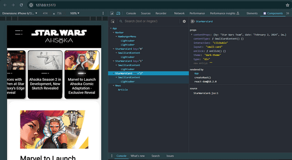
The React Developer Tools Chrome extension really helped me out with this project. This tool enabled me to see the selected React component, the details of the props, and more.
Utilizing this tool led me in the right direction: using the selected key value to display the selected news article story.
I highly recommend using the React Developer Tools Chrome extension for your projects!
Building Flexible React Components
✔ Mission accomplished! We've covered in detail how to build a React component that renders flexible HTML layouts based on the data objects passed into it. You should now have enough insight on how to build similar flexible customized React components for your projects.
For those following my series on building an Ahsoka Star Wars React website, feel free to keep reading to see how I added the News component to my project and the challenges I encountered during the integration.
Prerequisites
Building on the series of articles about creating a "Star Wars Ahsoka React website," understanding the implementation of the dynamically rendered "News" component requires familiarity with certain concepts. Please refer to my previous articles to understand the custom components and functions used.
The prerequisites for creating the carousel include:
- Familiarity with the Navbar component.
- Familiarity with the Hamburger menu component.
- Familiarity with the SmallCardContent component.
- Familiarity with the mapItems function
Article Series:
- Learn to Use Component Identifiers as Props for Rendering Various HTML Elements Dynamically
- A Guide to Better Code Organization in React through File Separation
- Building a Dropdown Menu in React: A Step-by-Step Guide
- Developing a Dynamic Hamburger Menu in React: A Step-by-Step Guide
- How to Integrate YouTube Videos into React Applications
- How to Integrate a Carousel into React Applications
Creating a Helper Function
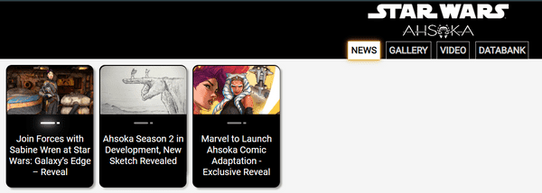
I used the same method to render the news component as the YouTube component; small Star Wars card components are rendered to represent each news article when a user clicks on the "NEWS" button on the Navbar.
The handleNewsClick function takes an object with two properties as its parameter:
categories: An object that contains various categories, including anewscategory.setSelectedCategory: A function used to update the state of the selected category.
export default function handleNewsClick({categories, setSelectedCategory}) {
    setSelectedCategory(categories.news);
}
Although the handleNewsClick function works as expected, I had difficulty adding it to my helpers.js file.
Notice how I am using "export default" in the codebook above. When I tried to add the handleNewsClick function to the helpers.js file, I now had two functions in the file, so I had to remove the export default. Once I removed the export default, I kept running into a React error that was telling me that an export default was expected.
Reluctantly, I opted to break best coding practices and create a new file, handleNewsClick.js, just for the handleNewsClick function, which resolved the React export default error.
Selected Story useState Variable
Now that the small Star Wars card components are rendered to represent each news article, the corresponding story is displayed when a user clicks on a card. By default, the first story is selected and rendered. This functionality is managed using a React useState variable and a useEffect hook.
const [selectedStory, setSelectedStory] = useState(0);Explaining How the Selected Story Works
In the App component, the selectedStory state is used to manage which news story is currently displayed. Here's a detailed explanation of how it works:
State Initialization
selectedStory is initialized to 0 using the useState hook. This state will hold the index of the currently selected news story.
Categories Object
The categories object contains various categories, including news, which holds the news articles.
Effect Hook for Initial Item Selection
The first useEffect hook runs whenever selectedCategory changes. If selectedCategory is not empty, it sets the first item of the selected category as the selectedItem.
Effect Hook for Setting Selected Story
The second useEffect hook runs whenever selectedItem changes. If the selectedCategory is news and selectedItem is not null, it updates the selectedStory state to the story property of the selectedItem.
Rendering the News Component
In the return statement, the News component is conditionally rendered when selectedCategory is news. The News component receives the news data and the selectedStory index as props.
Code Explanation
useEffect(() => {
	if (selectedCategory && selectedCategory.length > 0) {
		setSelectedItem(selectedCategory[0]);
	}
}, [selectedCategory]);

useEffect(() => {
	if (selectedCategory === news && selectedItem !== null) {
		setSelectedStory(selectedItem.story);
	}
}, [selectedItem]);- The first
useEffectensures that when a new category is selected, the first item in that category is set as theselectedItem. - The second
useEffectchecks if the selected category isnewsand if there is aselectedItem. If both conditions are met, it updates theselectedStorystate with thestoryproperty of theselectedItem.
Rendering Logic
{selectedCategory === news && <News news={news} storyNumber={selectedStory} />}This line ensures that the News component is rendered only when the selectedCategory is news. The News component is passed the news data and the selectedStory index, allowing it to display the appropriate news article dynamically.
By managing the selectedStory state and using effect hooks, the App component ensures that the correct news story is displayed based on user interactions.
Key Takeaways:
- Dynamic Rendering: Creating components that render HTML elements based on object data allows for flexible and adaptable content layouts.
- State Management: Effective use of React's
useStateanduseEffecthooks is crucial for managing state and side effects in dynamic components. - Component Modularity: Breaking down the UI into smaller, manageable parts makes the code more modular and easier to maintain.
- Practical Tools: Utilizing tools like React Developer Tools can significantly aid in debugging and understanding component behavior.
The Project So Far
Here are the links to the project:
Advance your career with a 20% discount on Scrimba Pro using this affiliate link!
Become a hireable developer with Scrimba Pro! Discover a world of coding knowledge with full access to all courses, hands-on projects, and a vibrant community. You can read my article to learn more about my exceptional experiences with Scrimba and how it helps many become confident, well-prepared web developers!
Important: This discount is for new accounts only. If a higher discount is currently available, it will be applied automatically.
How to Claim Your Discount:
- Click the link to explore the new Scrimba 2.0.
- Create a new account.
- Upgrade to Pro; the 20% discount will automatically apply.
Disclosure: This article contains affiliate links. I will earn a commission from any purchases made through these links at no extra cost to you. Your support helps me continue creating valuable content. Thank you!
Conclusion
In your React coding journey, you'll eventually encounter a situation where a hard-coded HTML return structure won't meet your project's needs. I realized this when I tried to build a React component to render news articles. The component needed to be flexible enough to handle varying HTML structures for the body section while keeping the header and footer sections hard-coded.
The solution was to write a sub-program inside the main component responsible for rendering the news article. This scenario introduced me to the React coding concept of composing components, which is the practice of building complex UIs by combining simpler, reusable components. I resolved the varying HTML structure conundrum by writing an Article component that dynamically renders paragraphs and images based on the data provided, ensuring flexibility and adaptability in the layout.
Although I have gained a better understanding of creating complex React components, integrating the completed News component into my project presented its own challenges. The combination of using AI to pair program and spending too much time away from my project left me revisiting the code repeatedly, trying to understand how all the code works. Regaining an understanding of the code, I was able to incorporate the News component to work as expected. However, I still need to learn how to properly structure file separation, as I currently have two helper function JavaScript files when I believe I should have only one.
To help troubleshoot, I used the React Developer Tools Chrome extension to debug and understand the component hierarchy and props. This tool helped me see the selected React component and its props, guiding me in displaying the correct news story. I highly recommend using this extension for your projects!
Building projects on your own will reveal new React concepts that push the boundaries of your current knowledge, ultimately helping you grow and become a better developer. As I am learning by building a Star Wars React website, I encourage you to push past your current level of coding by creating projects that interest and inspire you!
Are you now confident in building flexible React components for dynamic HTML layouts? Have you tried creating your own dynamic components? Please share the article and comment!
Please share it!


